
project focus
UX / UI, VISUAL DESIGN, STYLE GUIDE, HTML / CSS, SKETCH LIBRARY, MOBILE APP DESIGN
Liftopia is an e-commerce platform that helps ski resorts sell tickets more effectively. The company had not worked with a designer in years. The VP of Product brought me on to create a unified design system to modernize their platform and speed up development.
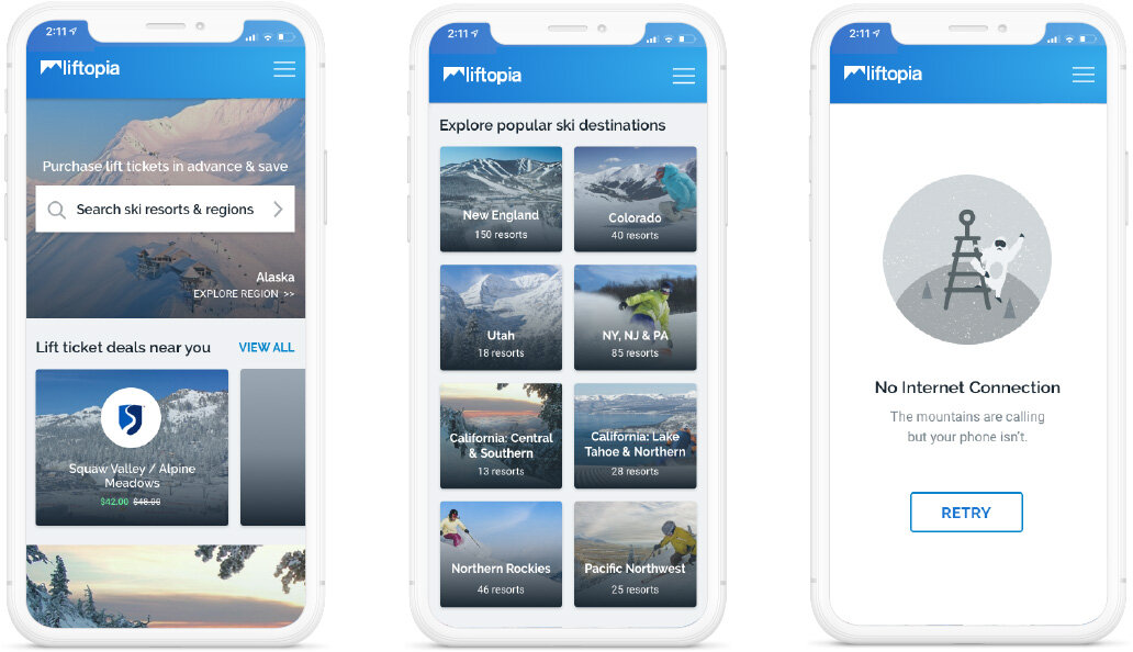
REDESIGNING THE MOBILE APP
The Liftopia mobile app had been totally rebuilt in React. The functionality was in place and the product team wanted to add visual design, polish and UX improvements.
I re-designed every screen of the app using Sketch, built an interactive prototype in Invision and delivered my recommendations during in-person design reviews with the dev team as well as frequent communication via Slack.
I a few months, the new version of the app went live and our product manager measured conversion rate. We were pleased to see a marked increase in the percentage of user sessions which resulted in a sale. The legacy version had a 1.54% conversion rate and the newly designed version of the app had a 7.18% conversion rate.

creating a sketch LIBRARY FOR PRODUCT MANAGERS
While designing the mobile app I began to construct a Sketch library of reusable components. You can think of it like a toolkit for design elements to help product managers quickly put together wireframes without needing to get me involved.
We used Abstract for version control and dynamic updates to this library, so that every time a component was added or changed, everyone’s files would automatically sync with the new style. This saved a ton of time and helped us move toward a more consistent look and feel for every mockup that was created by a member of the product team.
building a html/css style guide FOR DEVELOPERS
However, the website itself is very complex with many legacy features and a whole lot of content. It was not feasible to prioritize a total redesign of the website nor to create mockups for each individual page.
So I took a different approach. In general, many visual elements on a website rely on a set of shared styles: header text, body text, links, buttons, colors and global navigation. typography, color palette, buttons, navigation.
I decided to move forward by modifying these base styles, which had a ripple effect throughout the entire site. Along the way I worked to create a component library so engineers and PMs could reference and borrow elements that have already been created, rather than to create divergent styles.
The end result was a fresh, modern look for the website in a short amount of time. The long term impact is a consistent design language for the web and swifter front-end development.